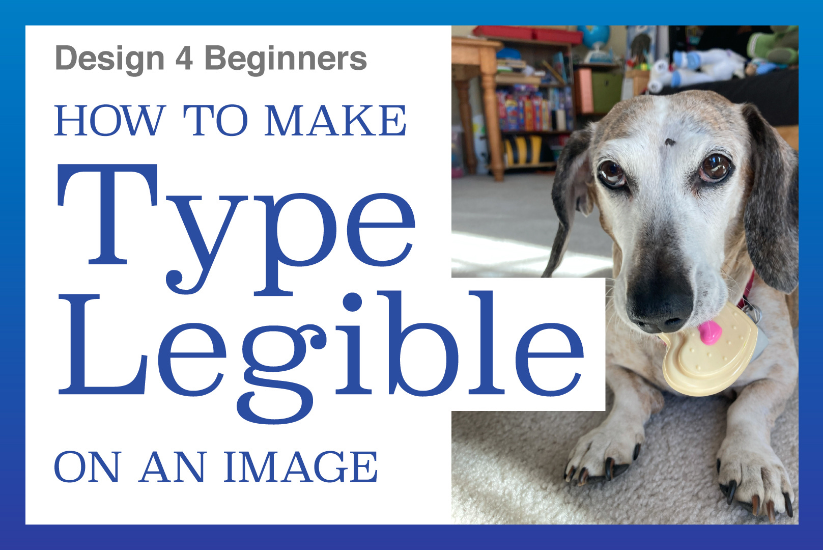
How to Make Type Legible on an Image
Design for Beginners – Week 3

Now that we’ve dug into manipulating images and then text, it’s time to combine these two elements.
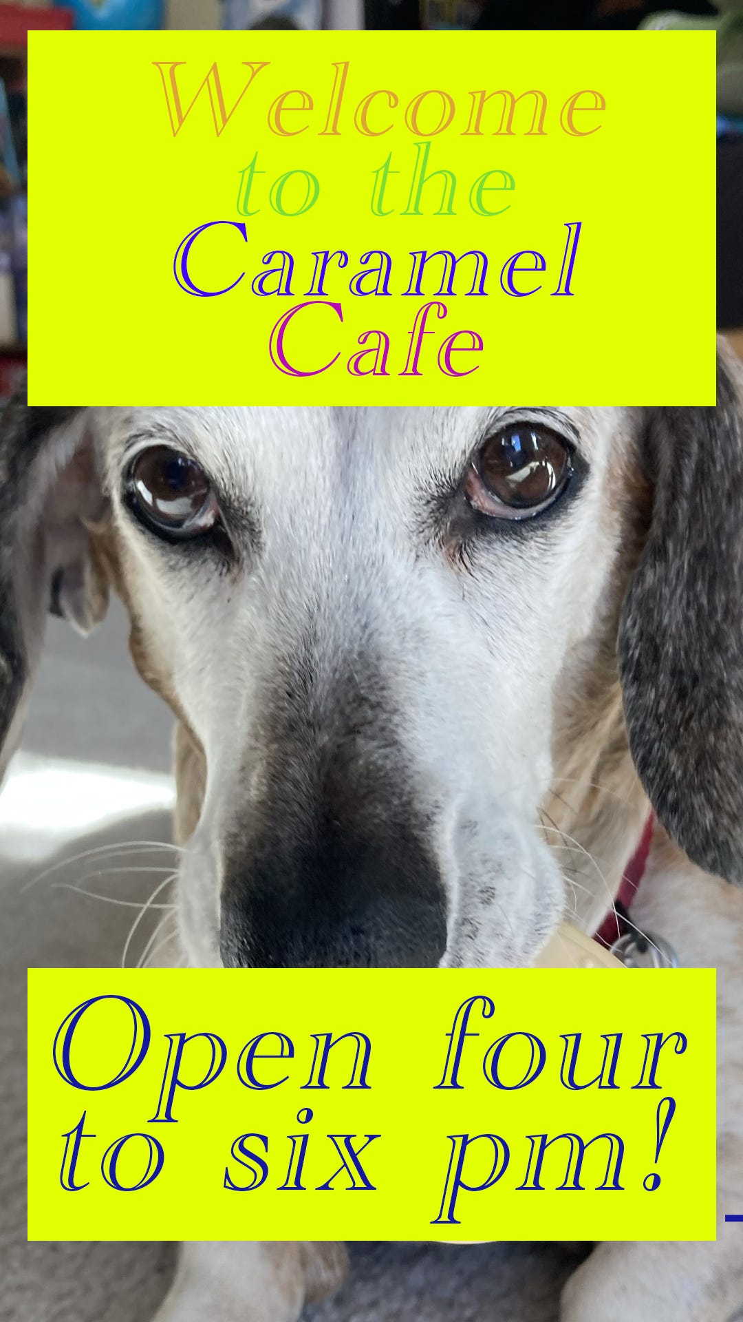
Once again I started with a photo of our family dog, Caramel. When my kids pretend they’re working at a restaurant, it’s called the Caramel Cafe. So we opened up a clean version of the dog’s photo and got to work.
Adding an Image
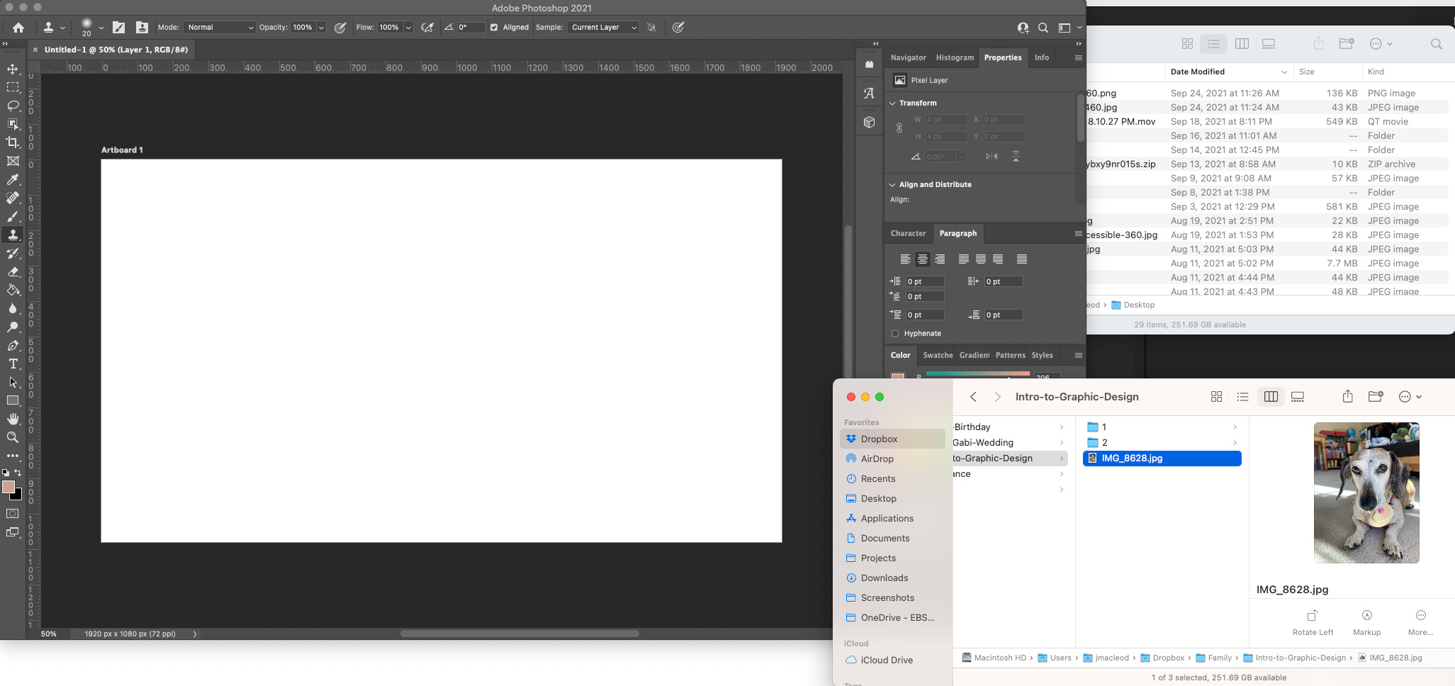
I had them open a 1080x1920px blank canvas in Photoshop, and then drag the photo in.
There are multiple ways to get the image added to this new canvas. The way we did it was to drag the image from the desktop Finder and drop it into the Photoshop canvas.
Another way to add an image to Photoshop is to click on File > Open, and then open the image in another document. Then you can either select all (cmd-A, ctrl-A), copy (cmd-C, ctrl-C), go back to your original document, and paste it (cmd-P, ctrl-P). This way is obviously more complex.
Resizing the Image
Because we are working with a document size that is different than the original dog photo, we to scale the image to the size they want. To do this, make sure you’re in the Move tool and on the correct layer. Then, go to Edit > Transform (cmd-T, ctrl-T). This brings up control bars on the corners and sides of the images so you can drag these points around and resize the image.
Note: Last year Adobe changed how images scale in Photoshop. If you click and drag on the corner points, it will scale in proportion to itself. In the past, you’d have to hold down Shift in order to maintain the proper proportions. Rumor has it that Photoshop made this change to align better with its iPad app. Other Adobe programs haven’t made this change yet, so there will be a disconnect when we work in other design platforms.
Once the image has been resized to your liking, you can hit Return and it will lock in the change.
Another note: You can scale images down, but you shouldn’t scale images up. What this means is that you shouldn’t transform an image and make it bigger than what you started with. When an image is scaled down, it loses resolution (it has fewer pixels). When that image is made larger, the lower number of pixels now need to be stretched, and the image appears blurry.
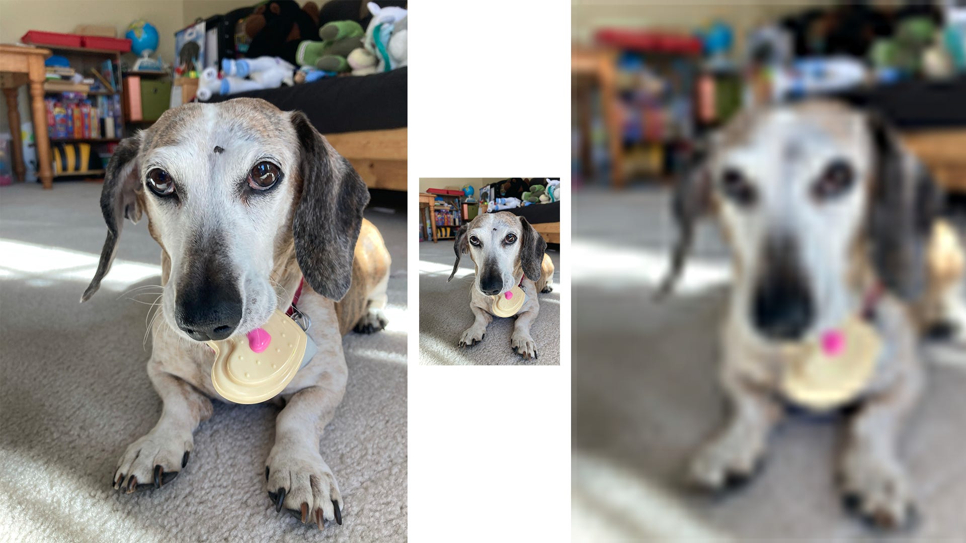
One way around this is to convert your image into a Smart Object. To do this, right-click on the name of the layer, and select Convert to Smart Object. This allows you to shrink your image, and then scale it back up without damaging the image. This increases your file size, but it is good in case you want do additional changes later.
Adding Type to the Image
Now, it’s easy enough to type onto your canvas using the Type tool. Using what you learned about the Character panel will help you select your typeface, sizing, leading, and all of that other fun stuff.
This time, it’s a little more challenging because you need the type to be legible if it’s on the background image. The image of the dog is complex, so there has to be some way to differentiate the text from the image.
My son resized the dog’s image so he had white space on his canvas and could put the text in that space. My daughter wanted a full-size dog image, so I got to teach her about ways to make text legible when it’s on a busy background.
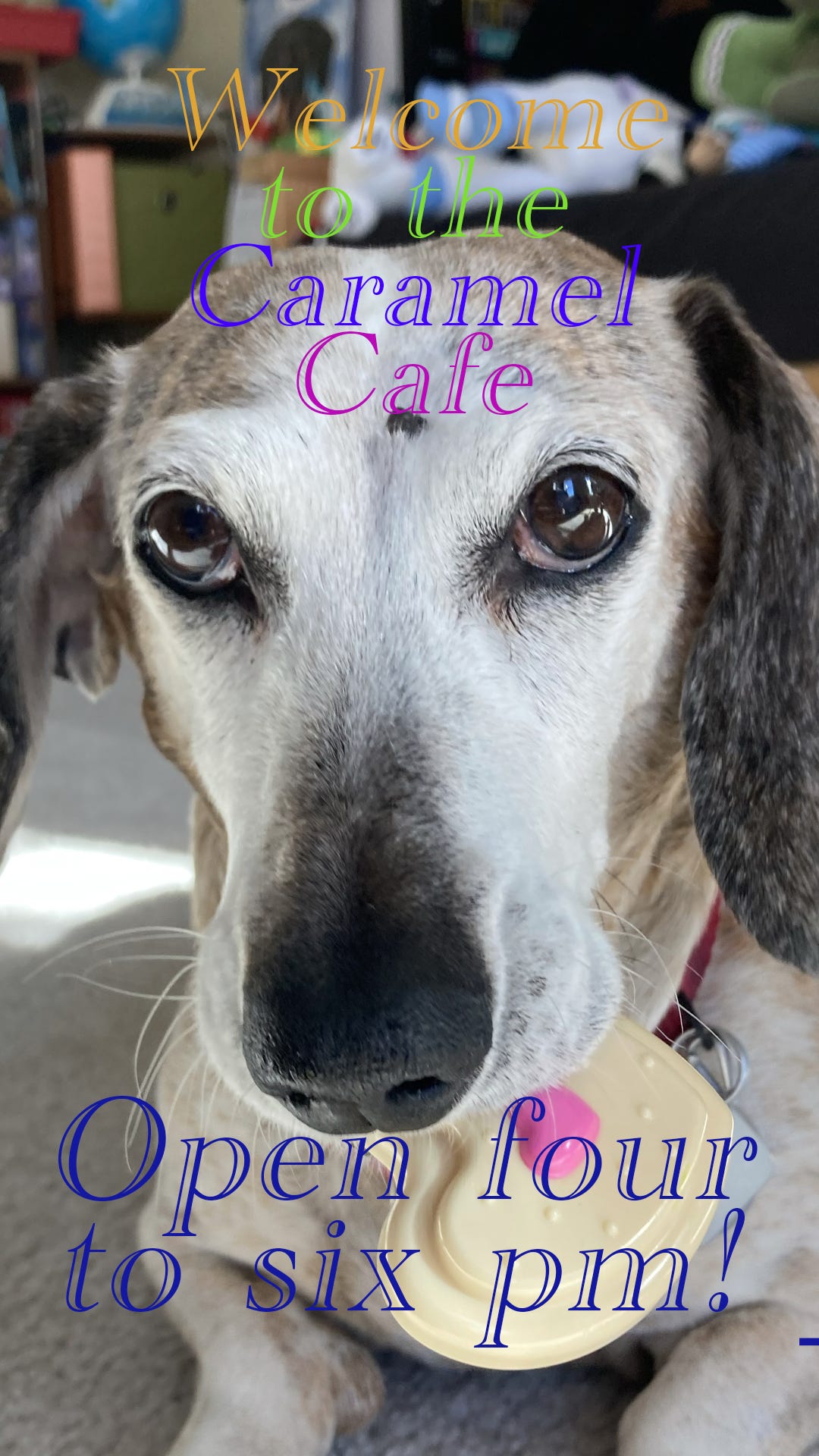
As you can see, the text is hard to read on the busy background. If the background was all light or dark, you can change your text to be an opposite color or tone to be legible.
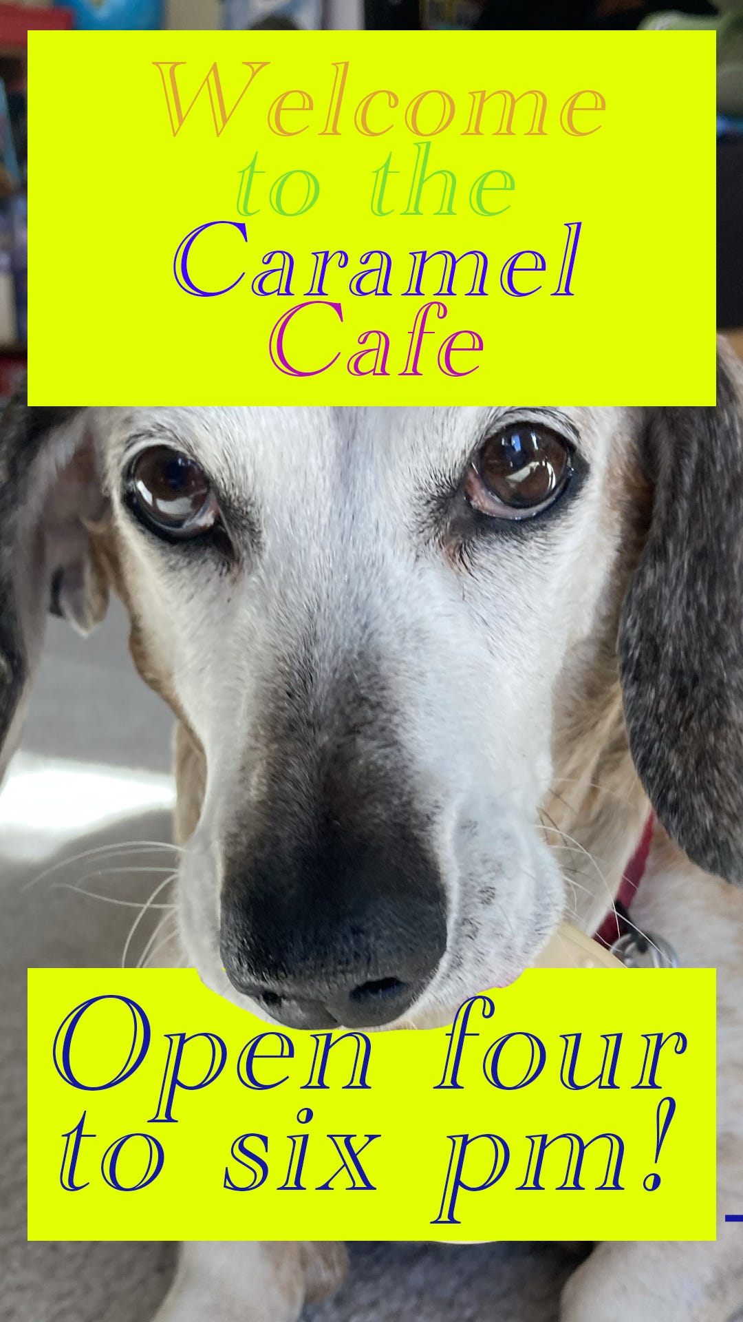
Since we have a busy background, I suggested putting in a couple blocks of color to make the text legible. This is better, but we could still do a little more.
Masks (no, not that type)
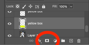
To have some additional fun, I introduced the concepts of layer masks. I wanted to create the illusion that the dog was holding the lower block in his mouth. To do this, make sure you have the correct layer selected, and click on the Mask icon at the bottom of the Layer panel.
Once the Mask has been added to your layer, select the paintbrush tool in the Tools panel on the left of your screen (or press B on your keyboard). Make sure your foreground color is black (#000000). You can then draw on the mask to denote which part of the layer will be visible. This process is a little odd because you won’t see anything you’re drawing on the canvas, but you’ll start to see certain areas disappear.
Spacing and Alignment
The biggest thing that separates designers from non-designers is spacing and alignment. Just like kerning, once you learn to see issues with alignment and spacing, you will see bad examples of it everywhere you look. For example, on this image, the spacing between lines of text (also known as leading) is not good.
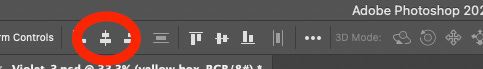
There are tools within Photoshop that help with alignment and spacing. As you see in the image above, the boxes are properly centered horizontally. There is a little alignment button at the top of the screen that can center or align objects within the canvas.
Margins
There’s a lot more we could cover with alignment, but for today, we’ll focus on margins. Using consistent spacing around your document will help the viewer’s eye move around easier. If there are elements that are bumping into each other, it creates visual tension. This can push the viewer’s attention to go in directions you didn’t want to go. We’ll get into heirarchy and eye flow in a later session.
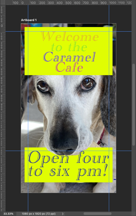
The spacing in this isn’t perfect, but it’s good for what we want to cover. To create guides like this, you’ll want to click on the ruler along the left side or the top. If you don’t see the rulers, go to View > Show Rulers (cmd-R or ctrl-R). Once you’ve clicked on the ruler, hold down your click and you can drag the guide out to the position you want. There is a little number that shows up near your cursor. This will help you position the guides exactly where you want them to go.
If your first guide is 100px from the left border, then your second guide should be 100px from your right guide. You may have to do some math to determine where this guide should go (document width minus 100px). It’s a pain, but it will help ensure everything is properly aligned. The same works with guides from the top.
If the guides become overwhelming or distracting, you can hide them by clicking on View > Hide Guides (cmd-; or ctrl-';). This action is also used to see the guides again.
Creating space around your text and elements help make the design work better. Everything has its clear space. People appreciate order. Doing this creates a graphic that people want to view.
Thanks for reading!
